Panasonic
eCommerce UI/UX
“It was a pleasure working with Ali. He doesn’t blindly follow requests from the client. He wants all design to be best in class UX-wise. So in many cases he provided a constructive feedback and UX articles convincing me to reconsider some of my initial decisions. I recommend working with him without a doubt.”
Łukasz Stachowicz
Digital Manager at Panasonic.
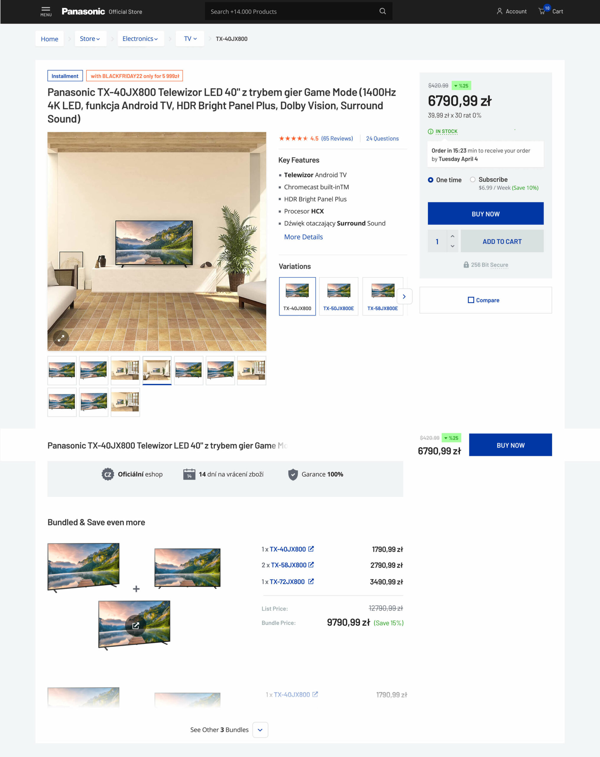
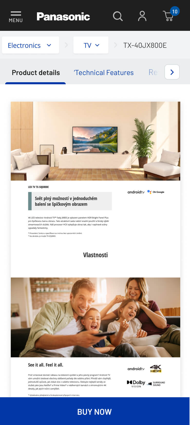
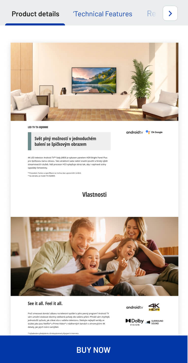
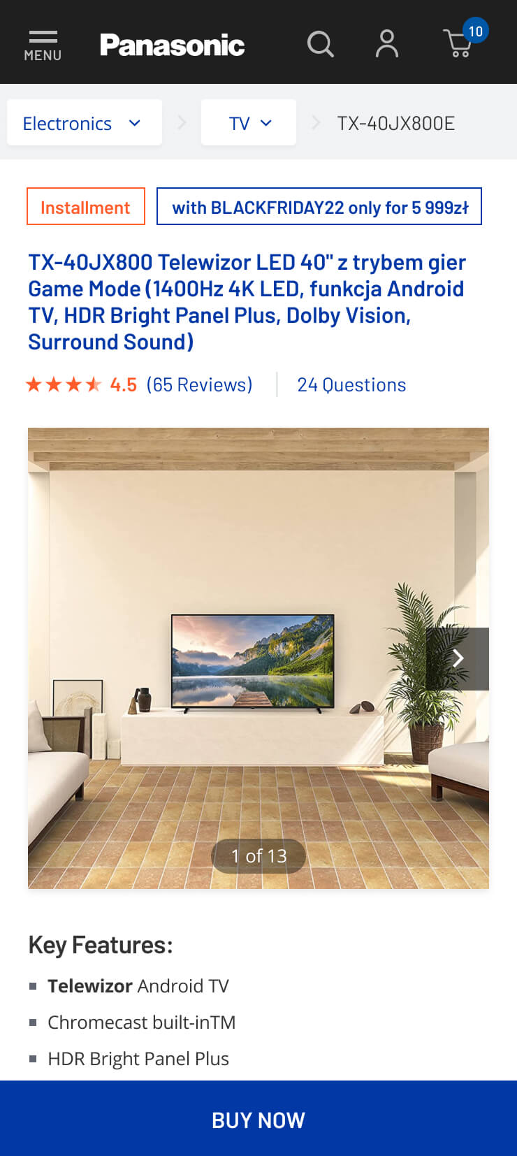
Prototypes
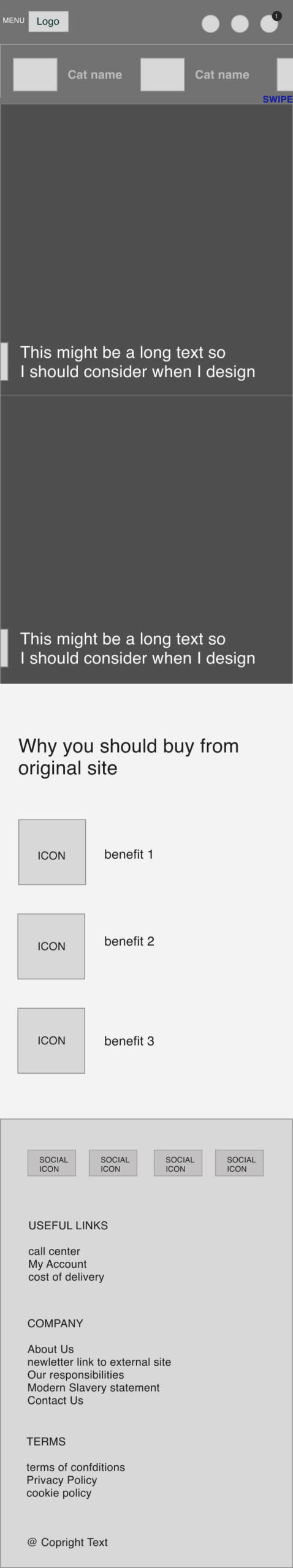
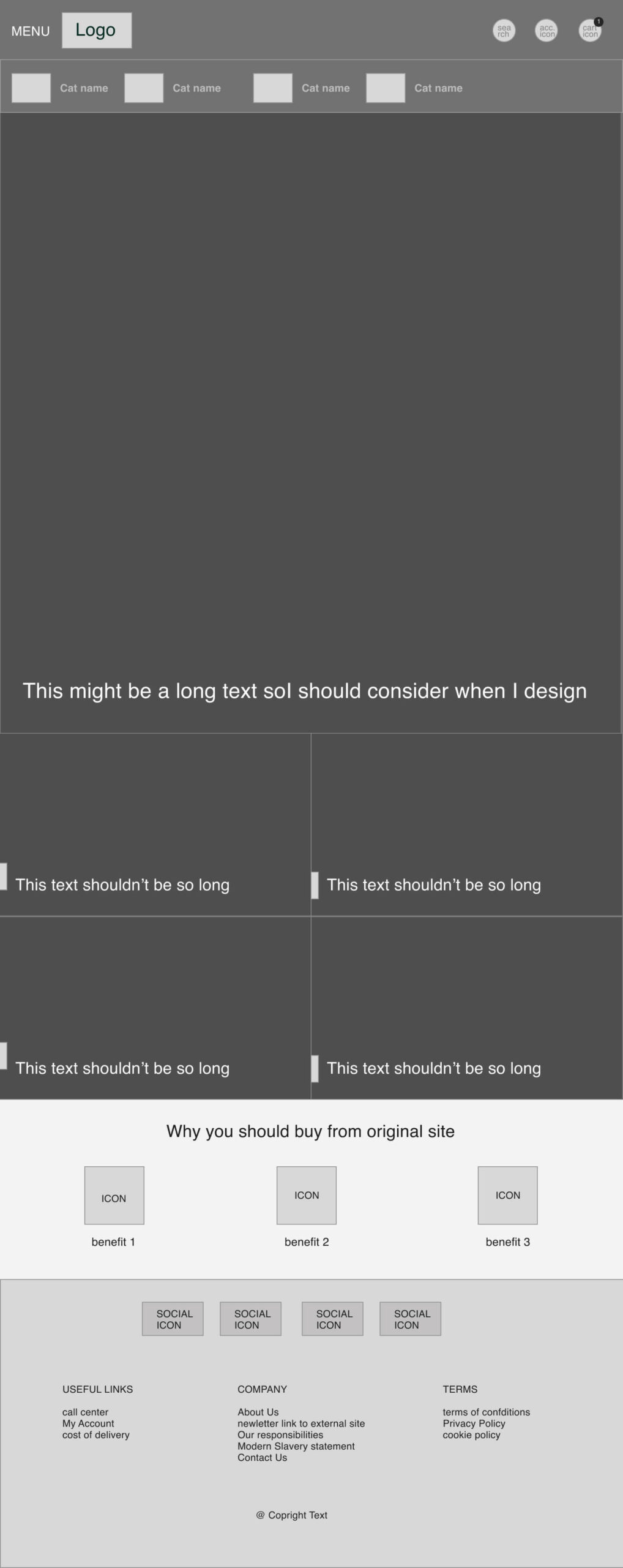
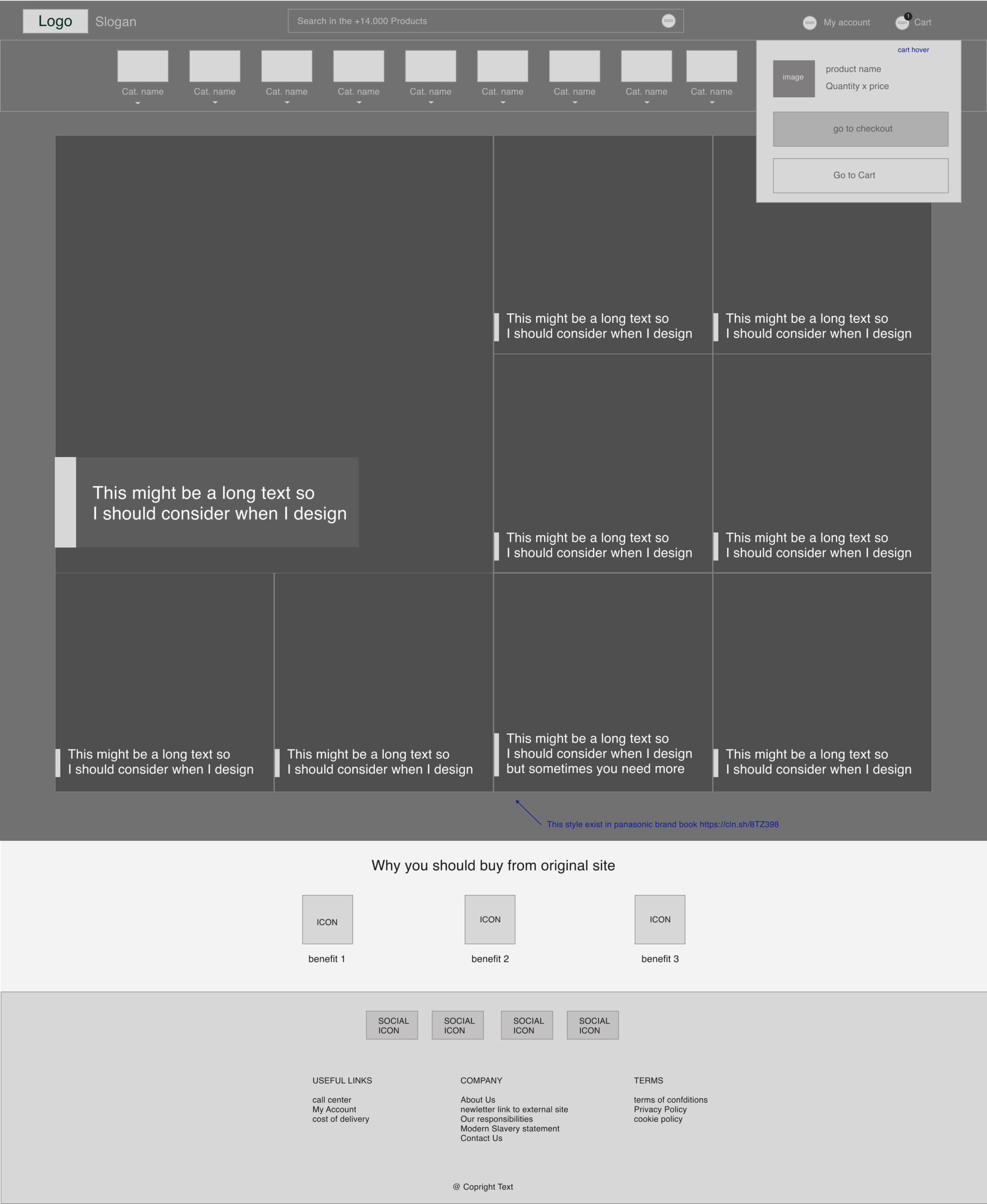
Design
Challenges
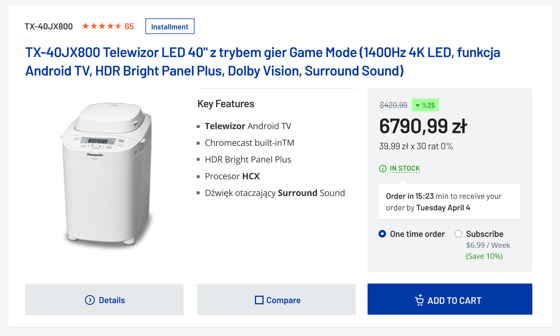
Panasonic has a brand guideline for stores, graphics, and social media. However, unfortunately, there was no guideline for web design. My main aim was to design consistent with the current guideline.
Typography Challanges
We couldn’t use Panasonic font for legal reasons. The font was DIN and I came up with Barlow font which is nearly the same as DIN.

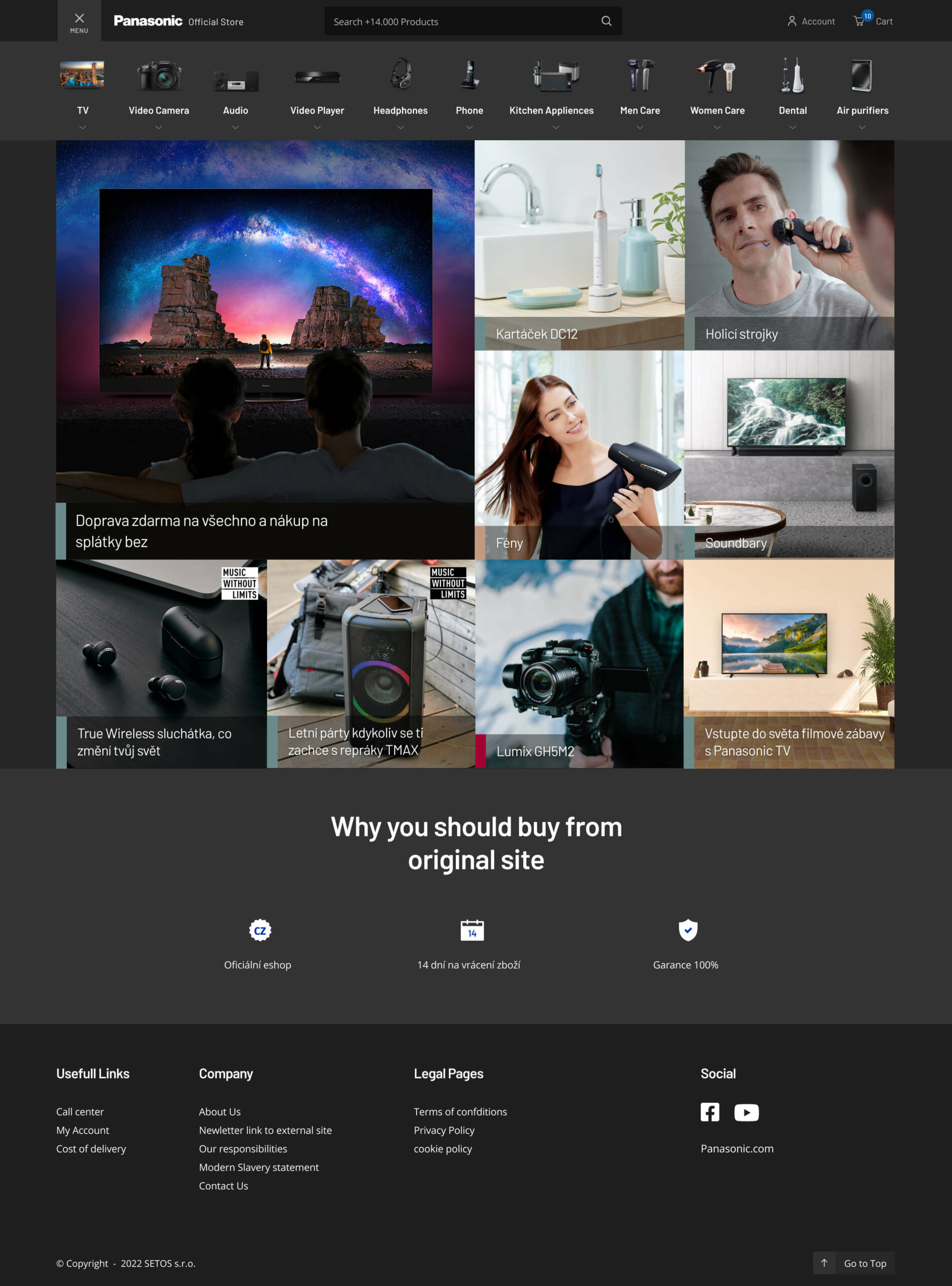
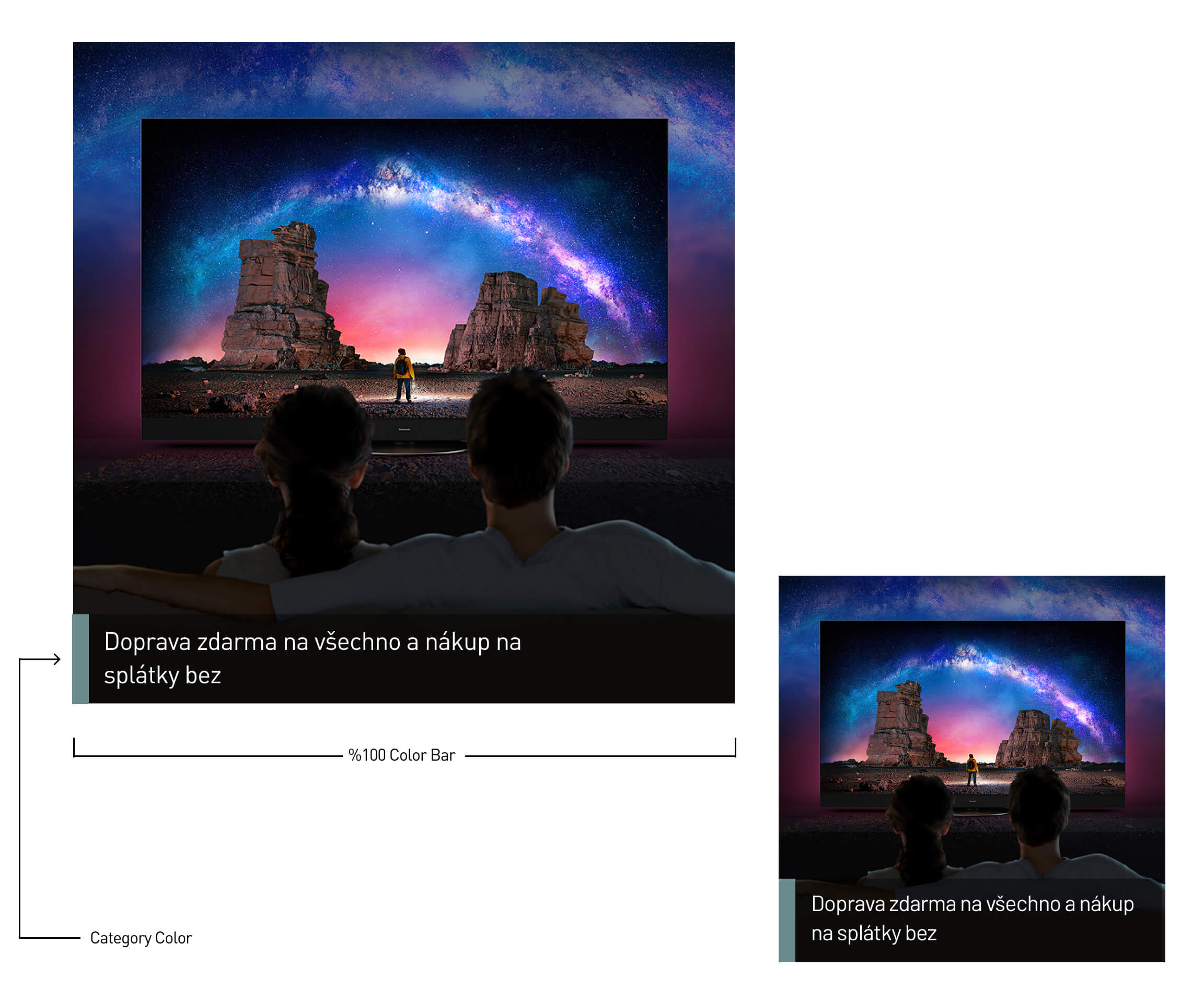
Color Bar Challange
This is the most important part of the Panasonic brand. Unfortunately, that was not ready for responsive devices. The idea was to squish the bar on responsive devices. It didn’t make much sense to me that we couldn’t use nearly 50% of that place when we already had a small space.
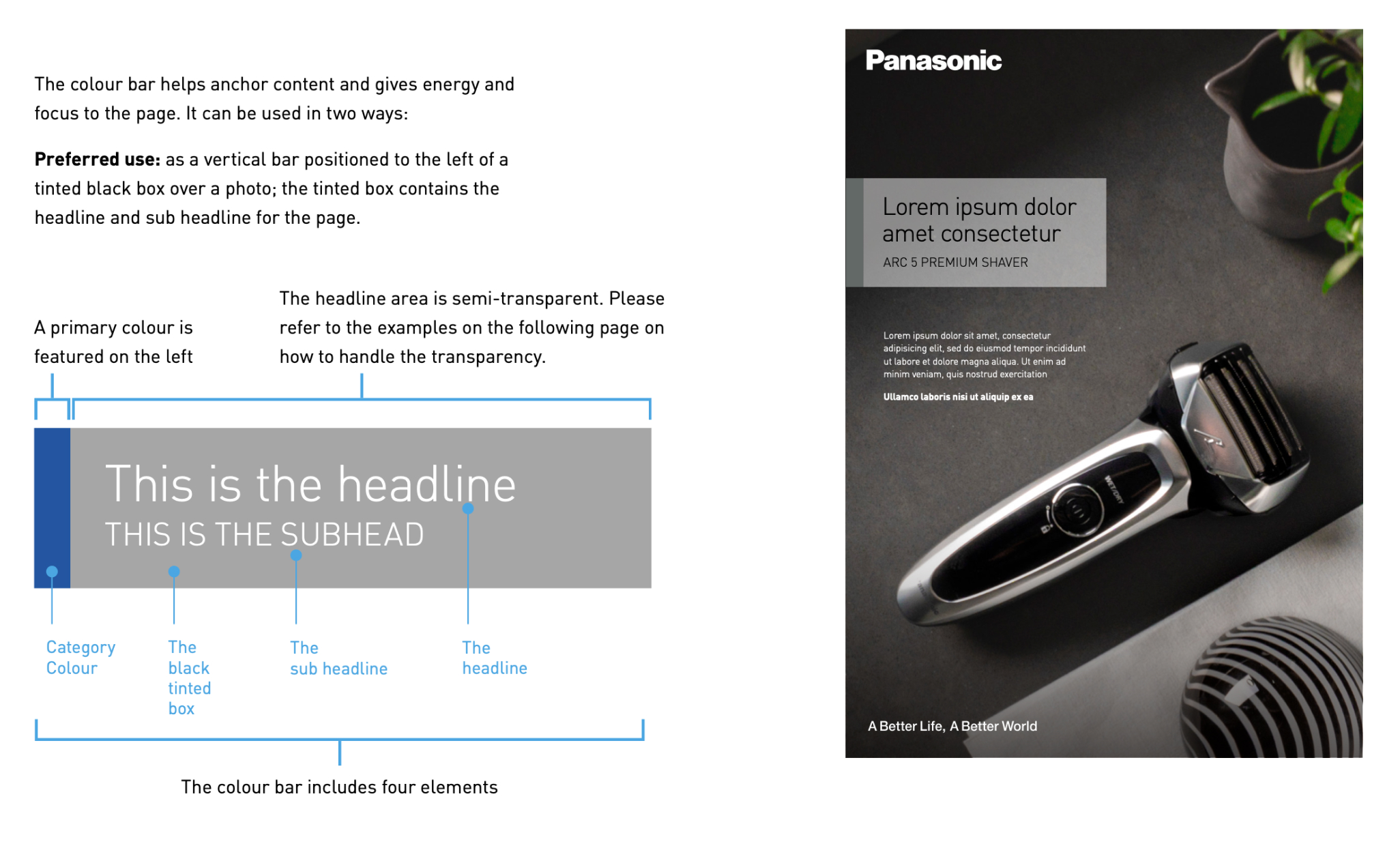
Solution
We decided to use that bar %100 along with respecting other rules on both desktop and mobile
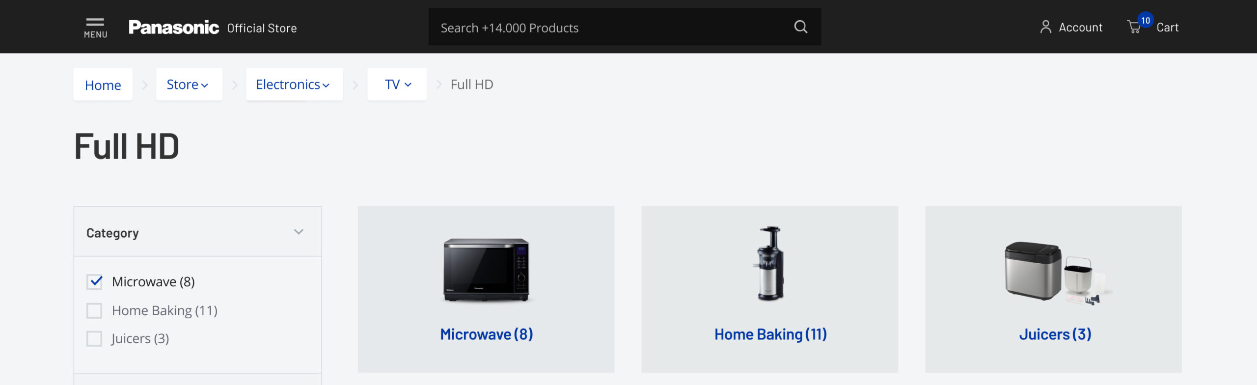
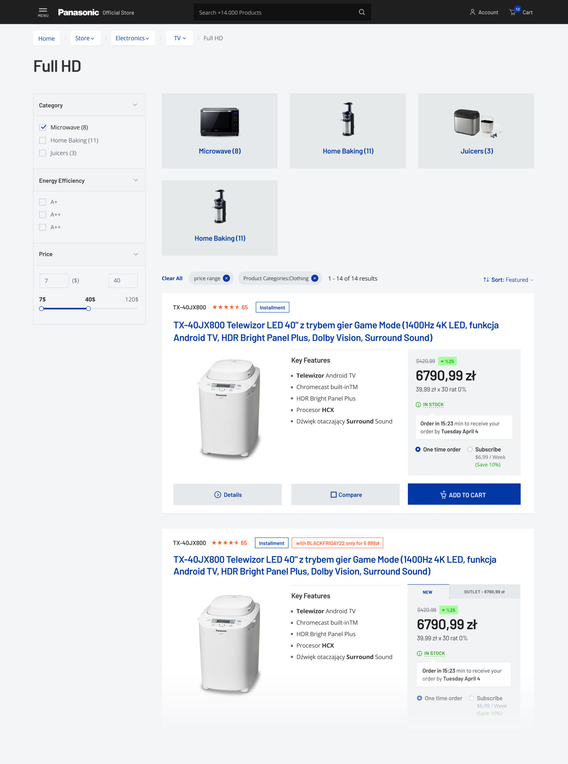
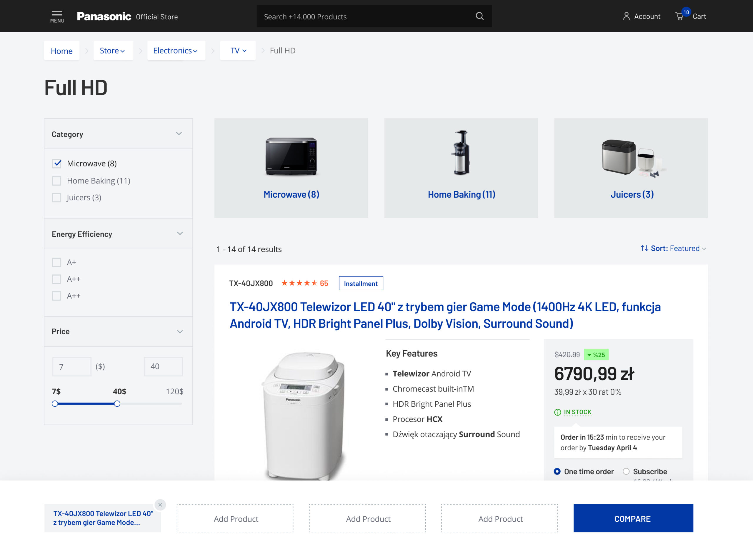
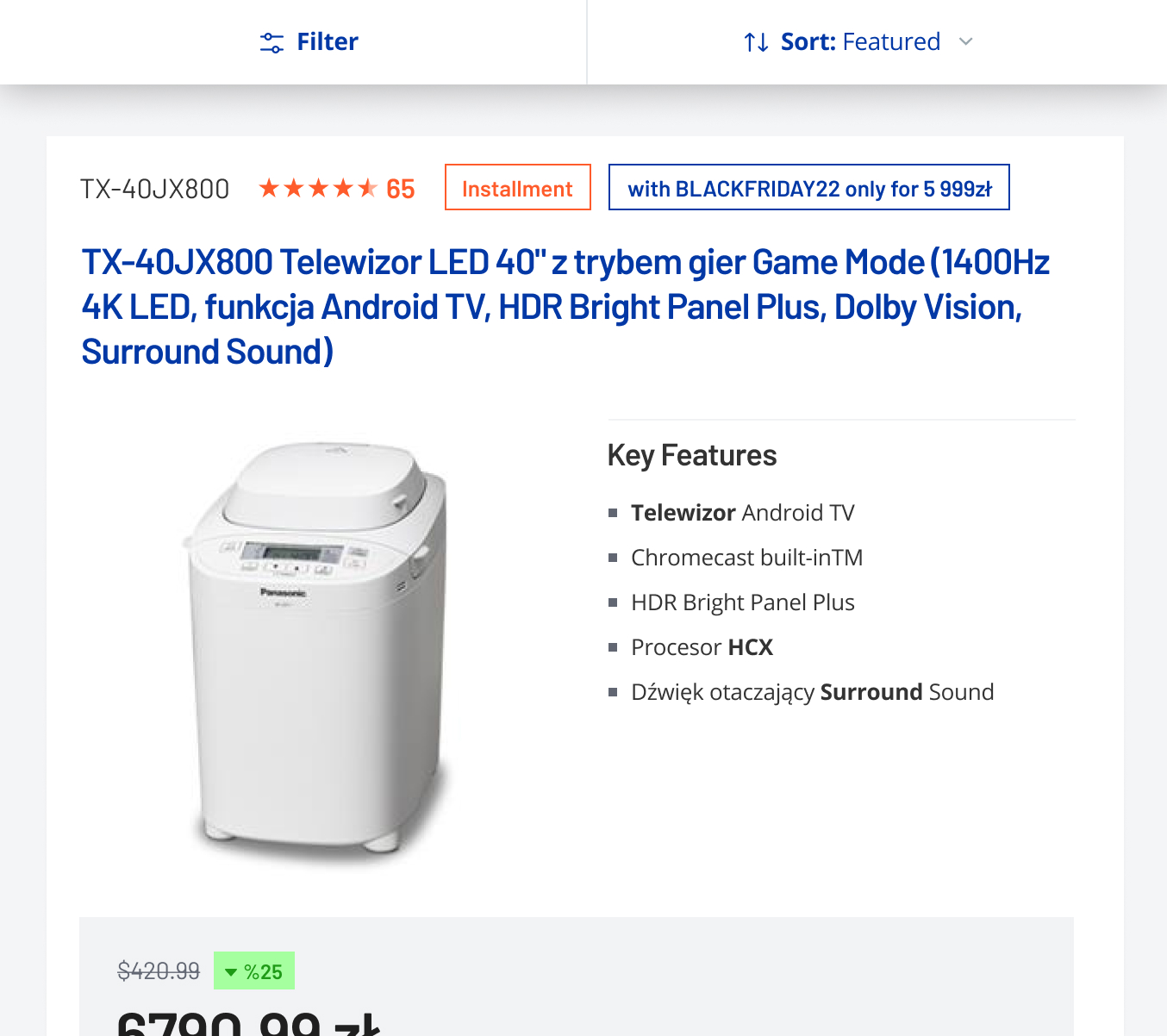
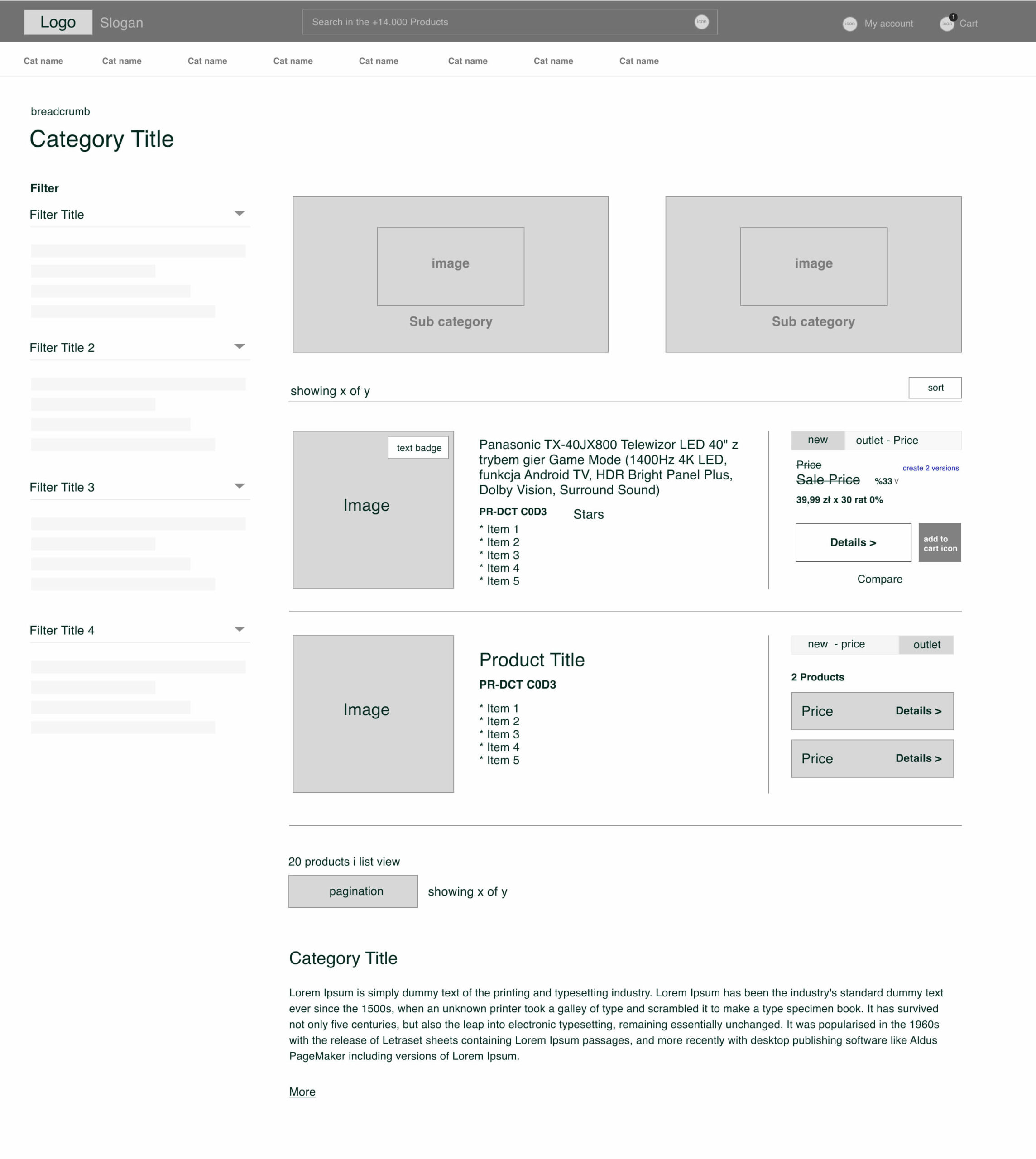
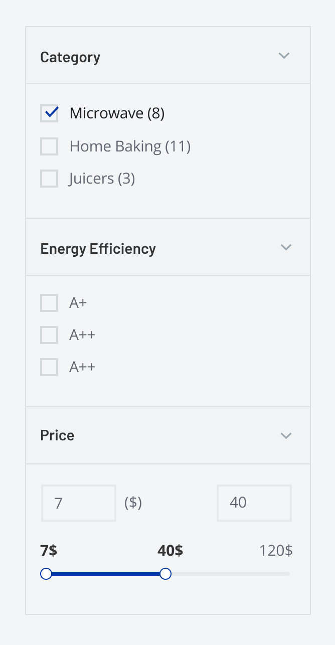
Ajax Filter
We show results immediately once the option is selected
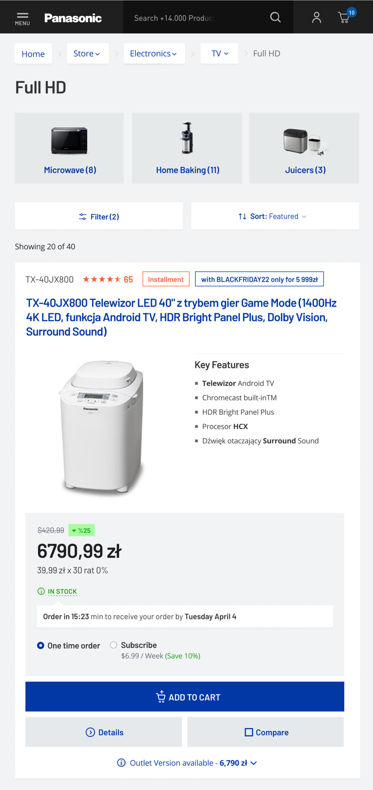
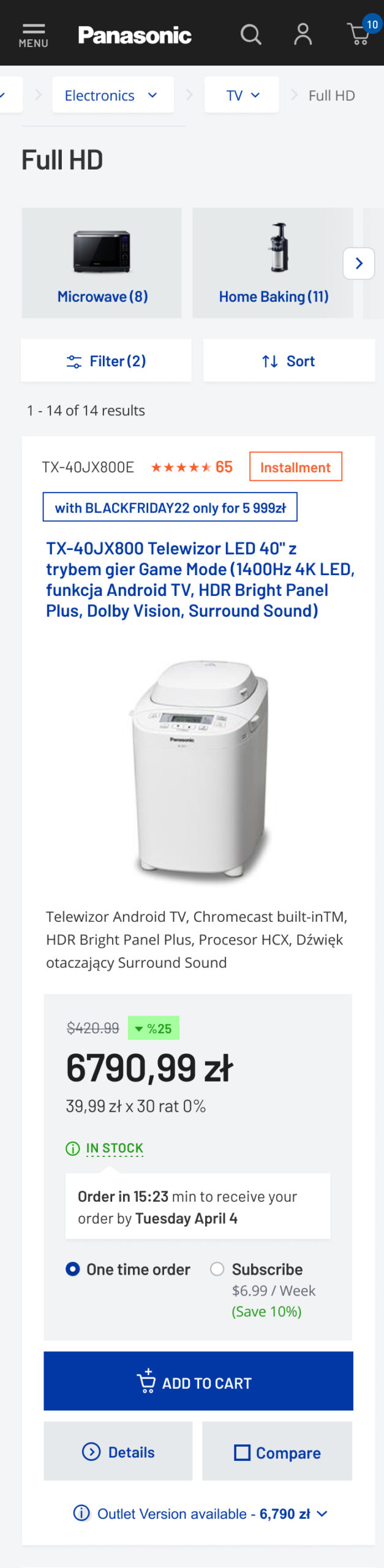
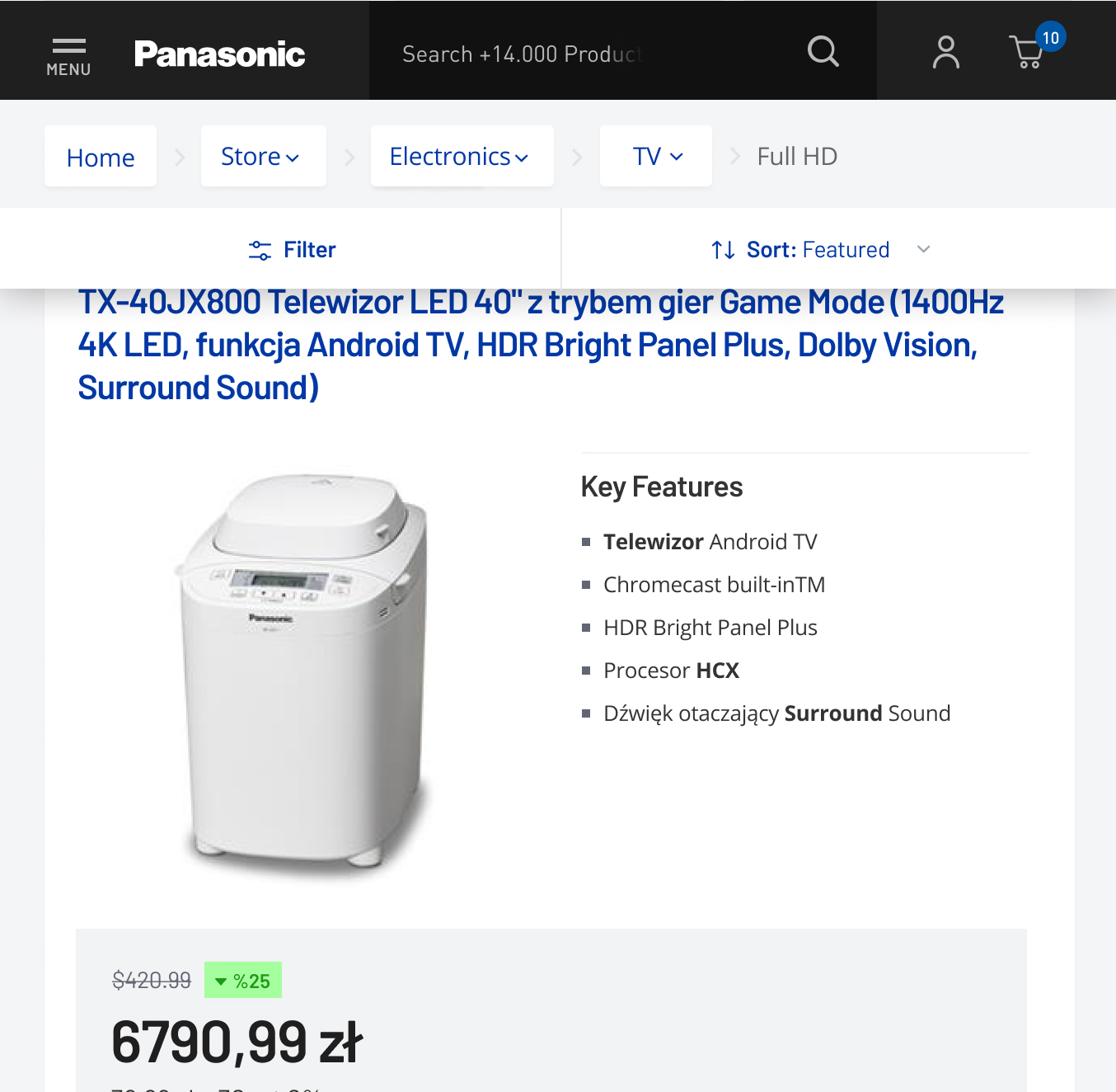
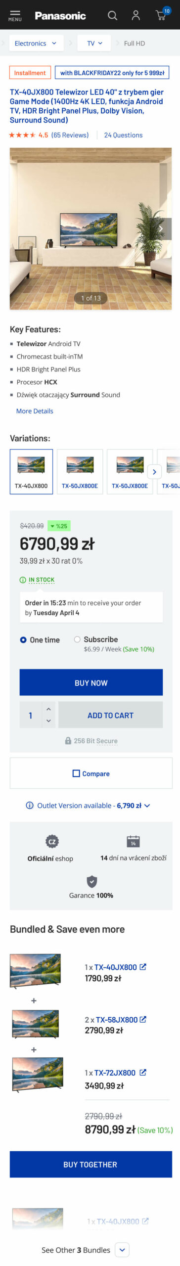
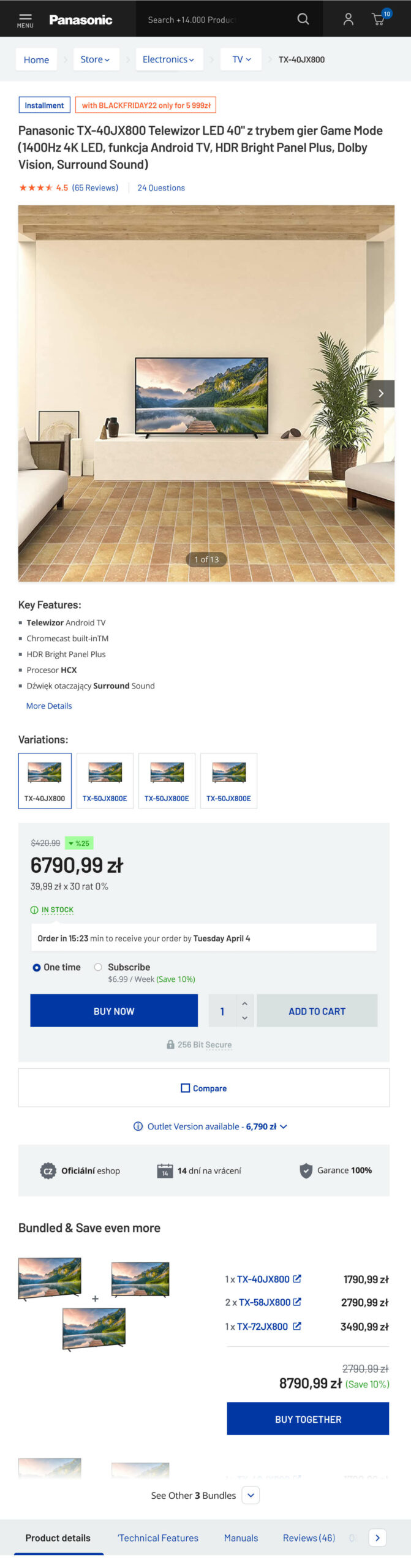
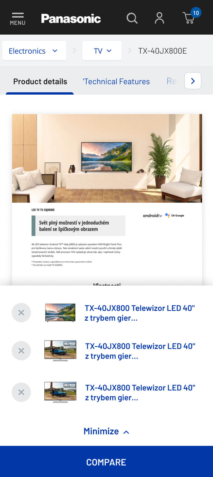
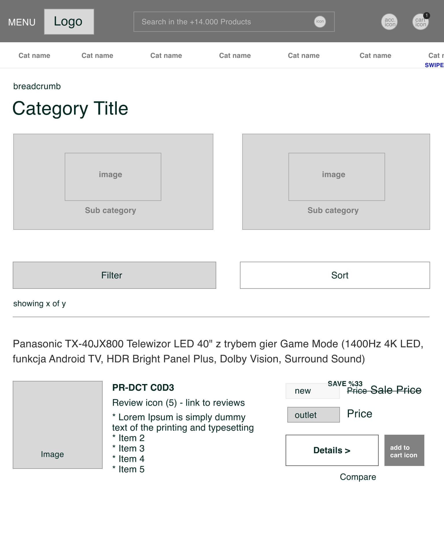
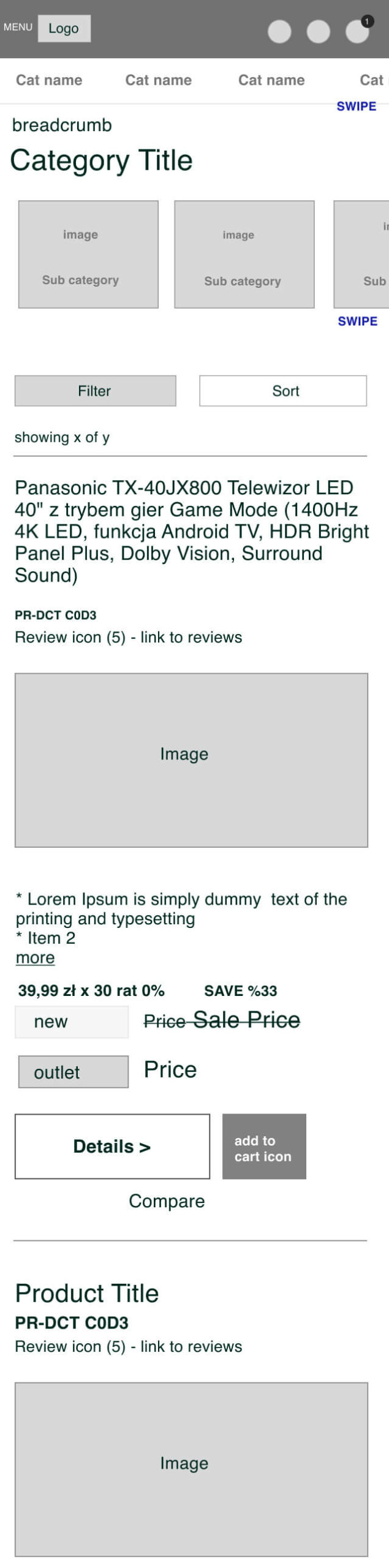
Category Page